Here’s your bi-annual reminder that almost everyone (from textbooks to infographics) fails to correctly explain the seasons: https://www.msn.com/en-us/weather/topstories/what-even-is-the-spring-equinox-and-what-does-it-mean/vi-AA1Z0a78?ocid=socialshare . It’s a 3D problem which makes accurately discussing it on a 2D infographic hard, but it’s far from impossible.
Month: March 2026
UC Davis Cloud Library
-
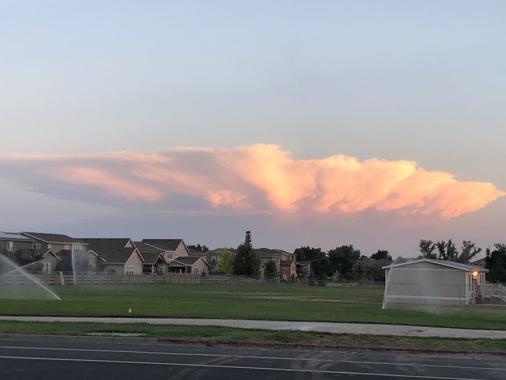
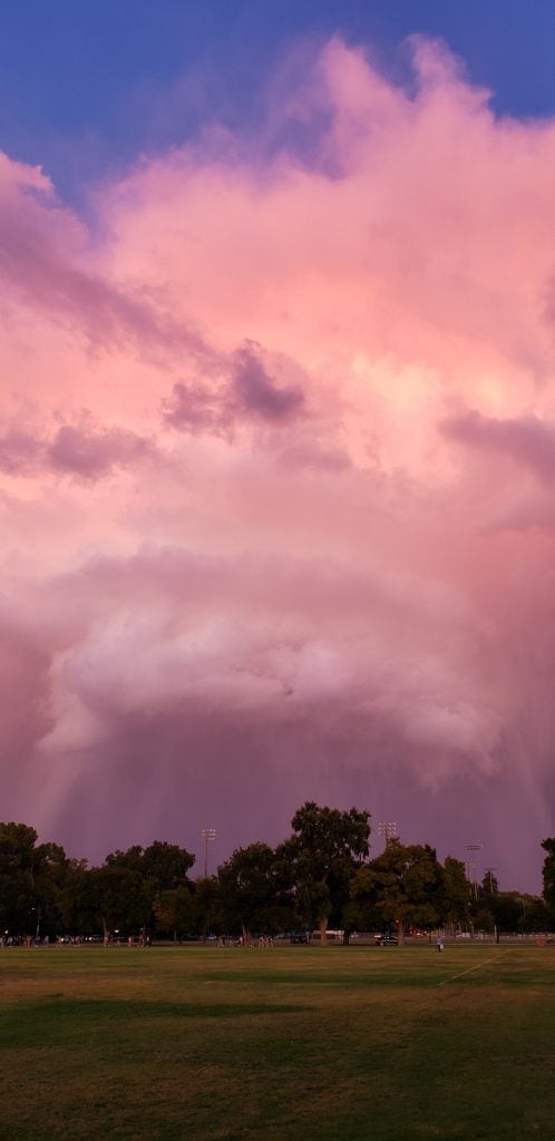
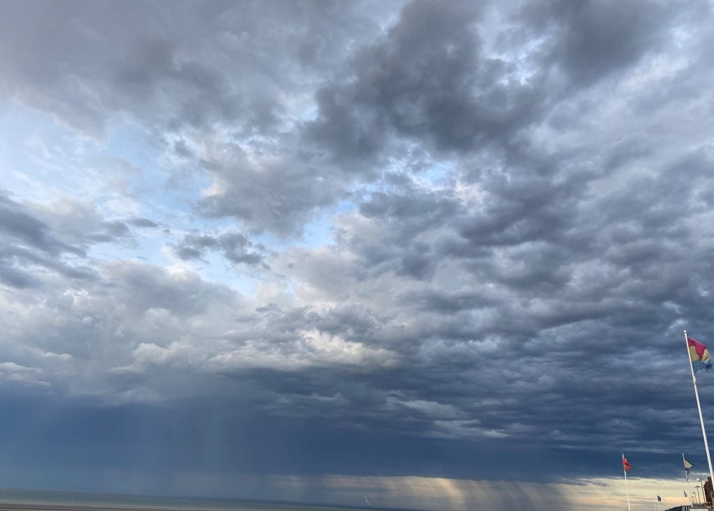
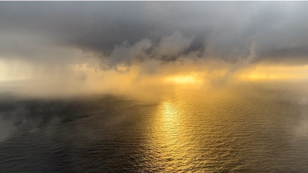
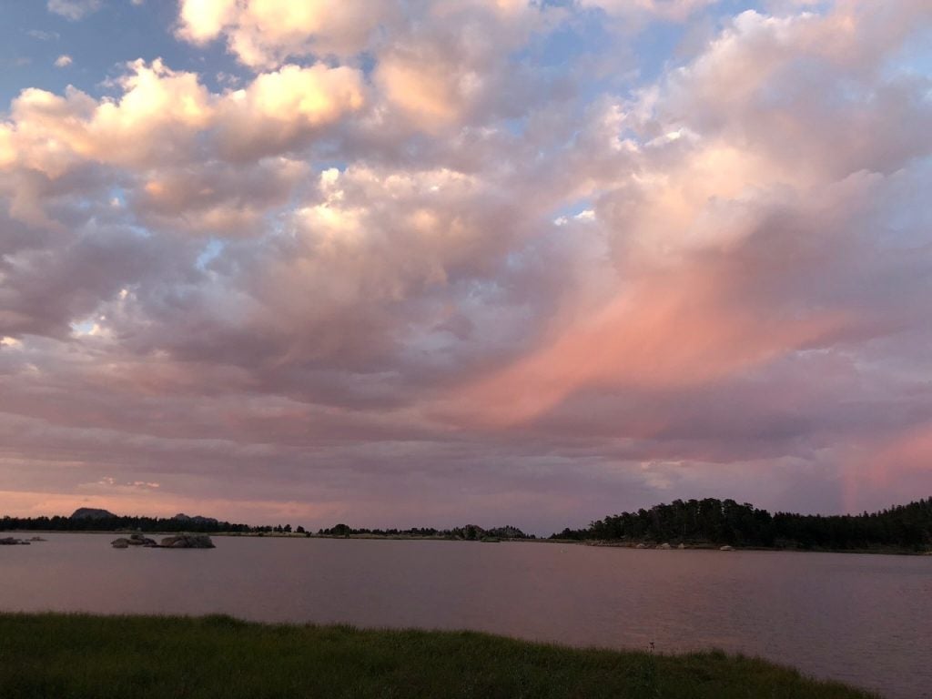
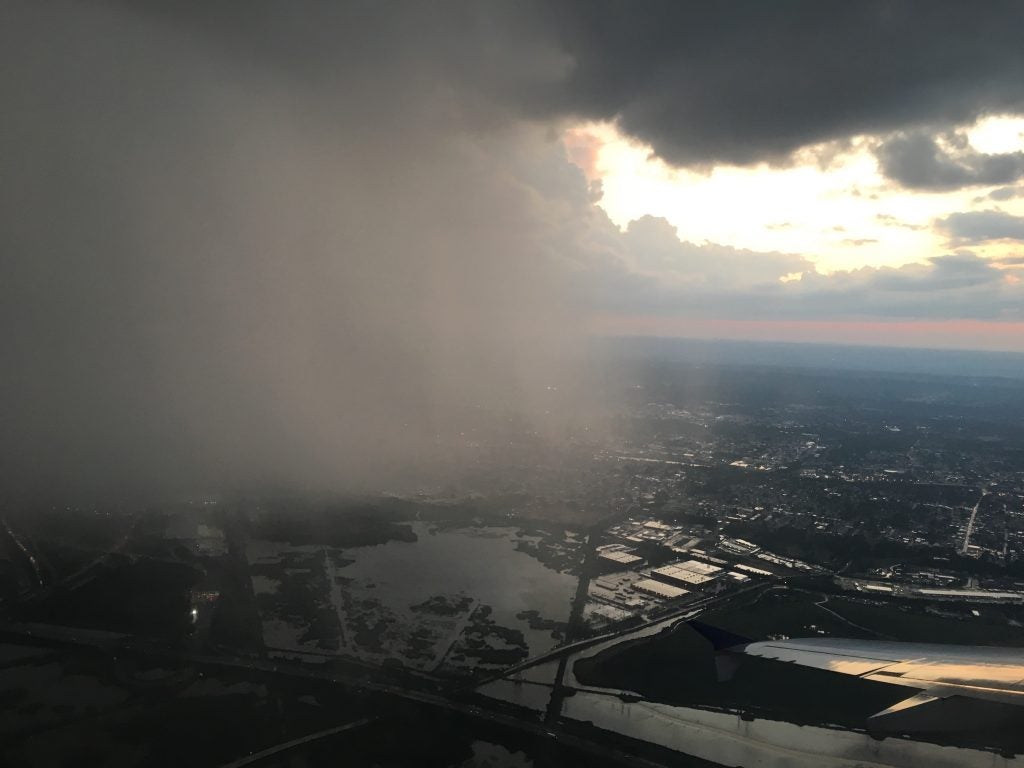
- Outflow like Woah © John Igel.
-
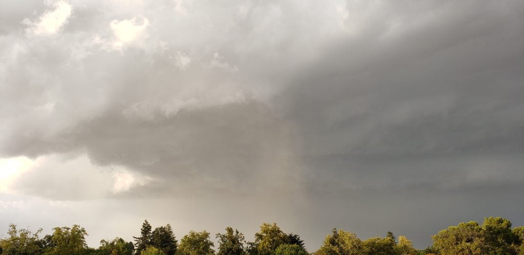
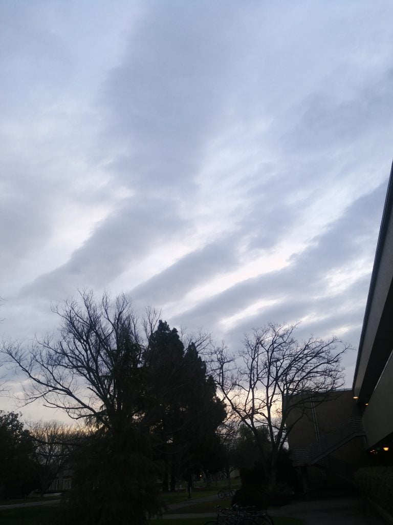
- Hard Edges
-
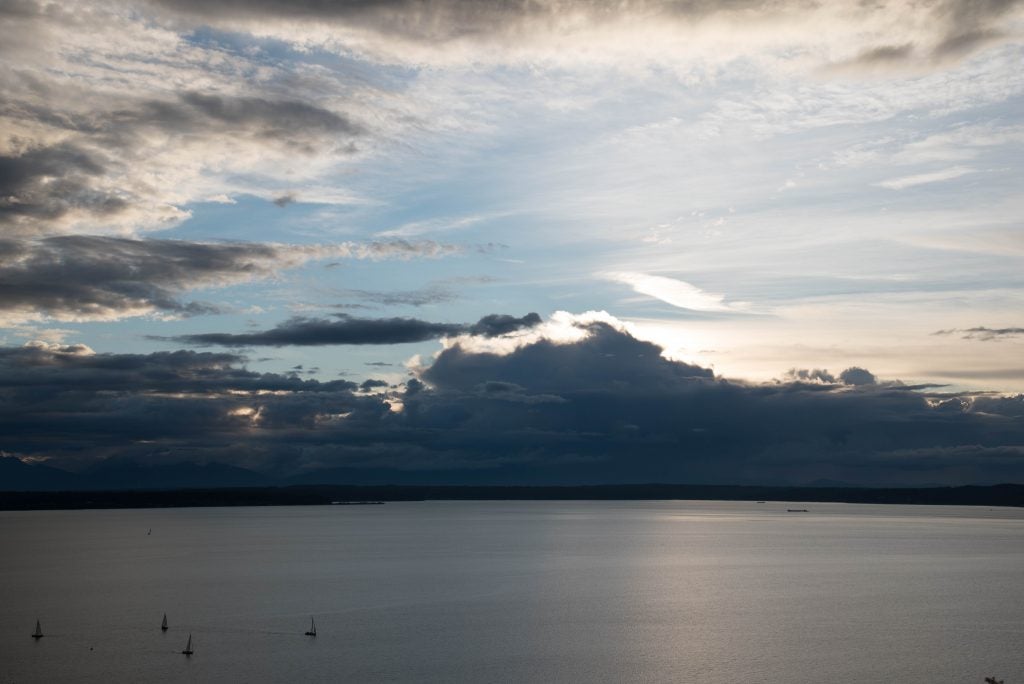
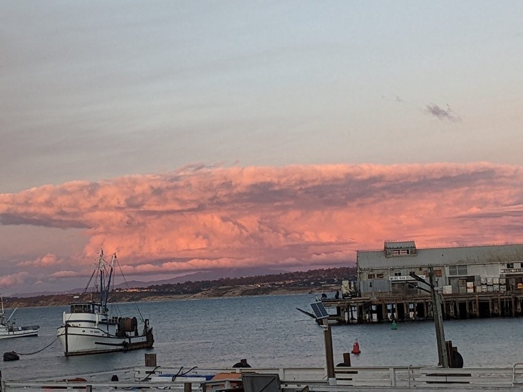
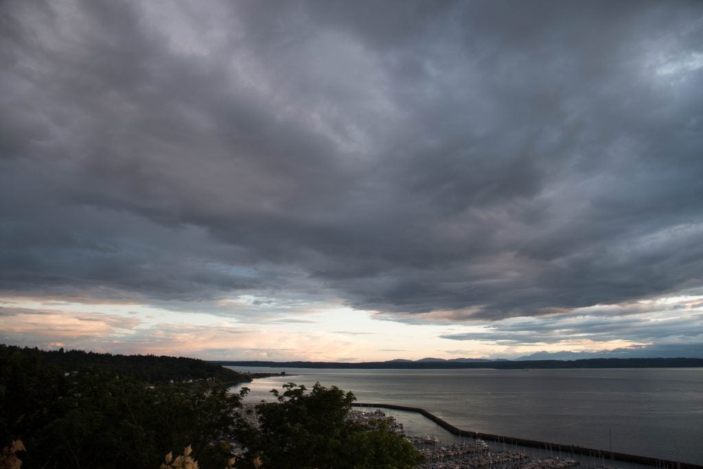
- Seattle Sunset behind Olympic. © Katherine Chin
-
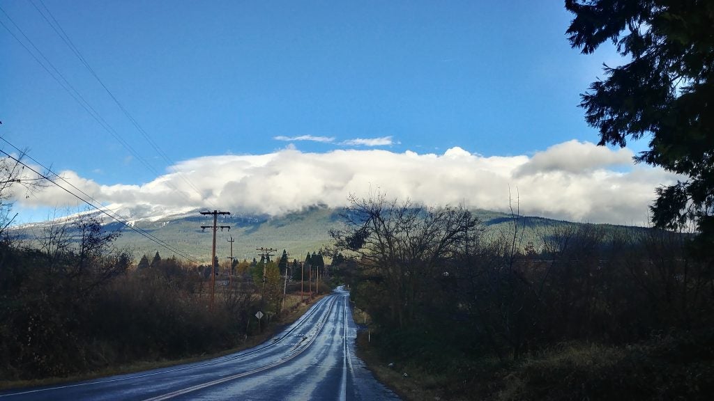
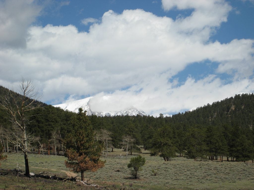
- Clouds over Mt Shasta
-
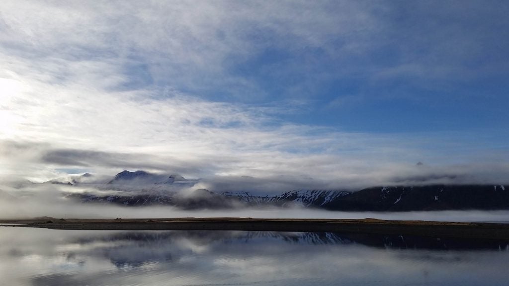
- Iceland. © Katherine Chin
-
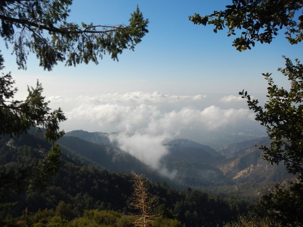
- Mt Wilson © Jenae Clay
-
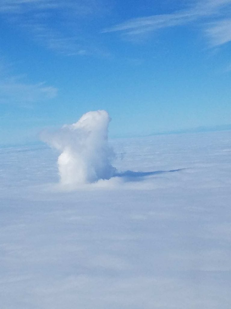
- New Cells © John Igel
-
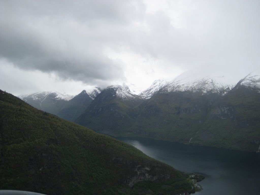
- Norwegian Fjord
-
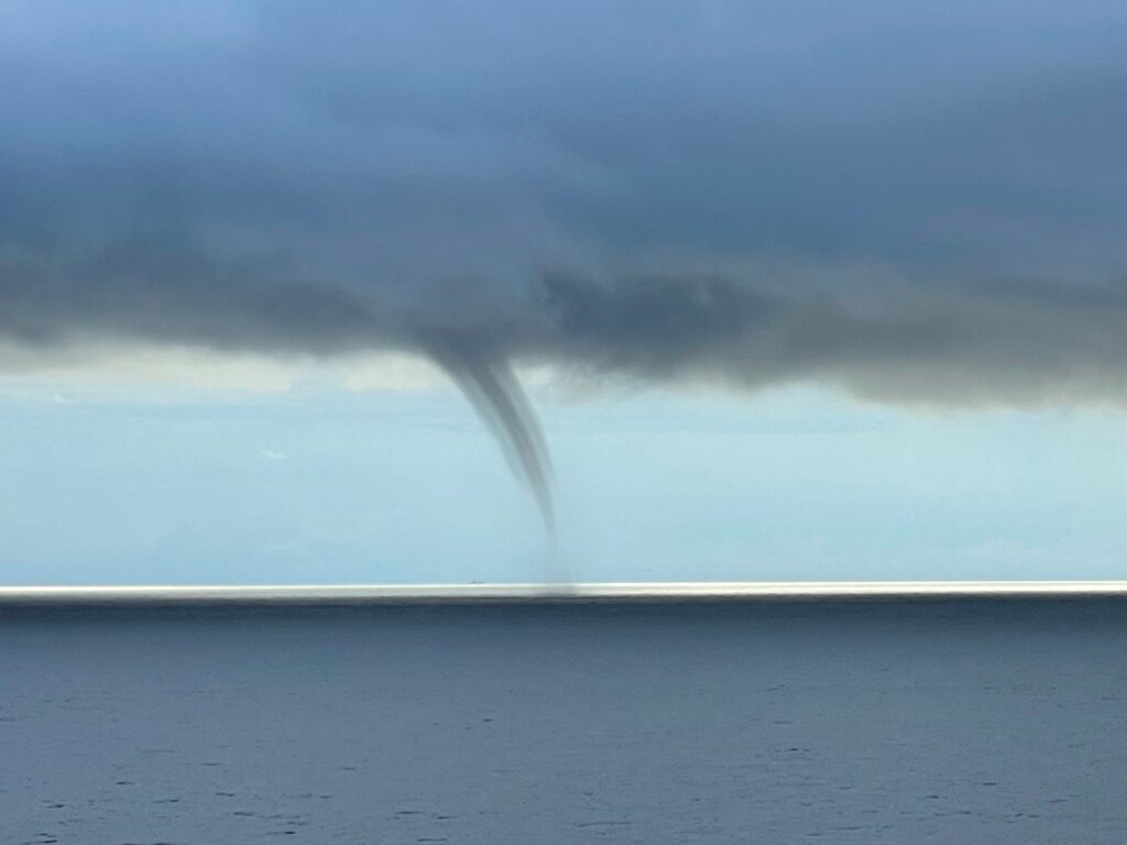
- FL Water Spout. © Walter Milton
-
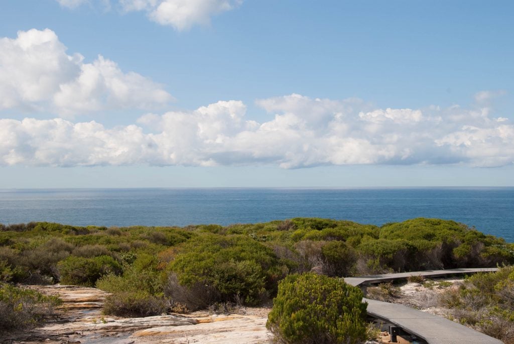
- Royal National Park, Australia. © Katherine Chin
-

- Puffy in WY. © Jen Power.
-
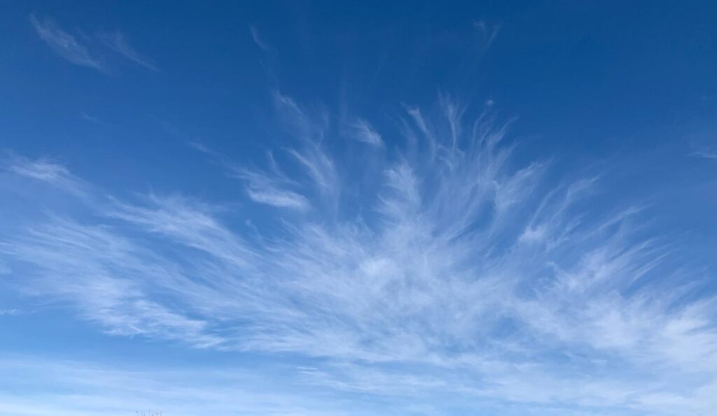
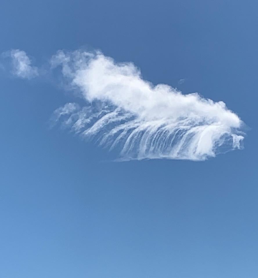
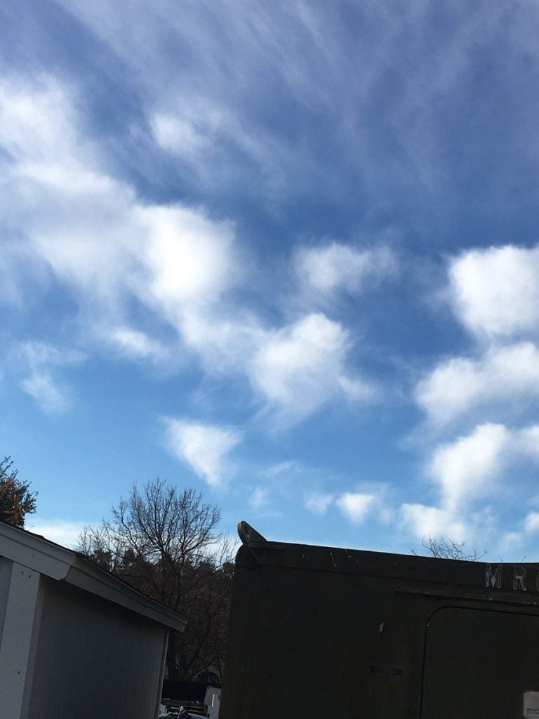
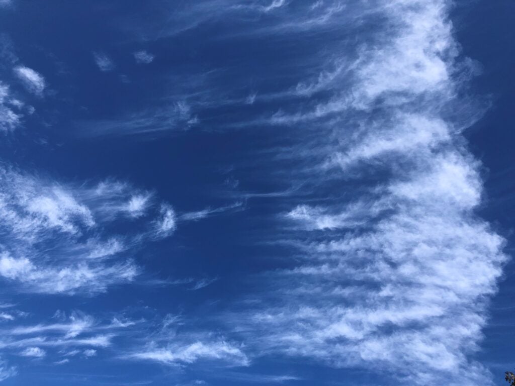
- Mare’s Tail
-
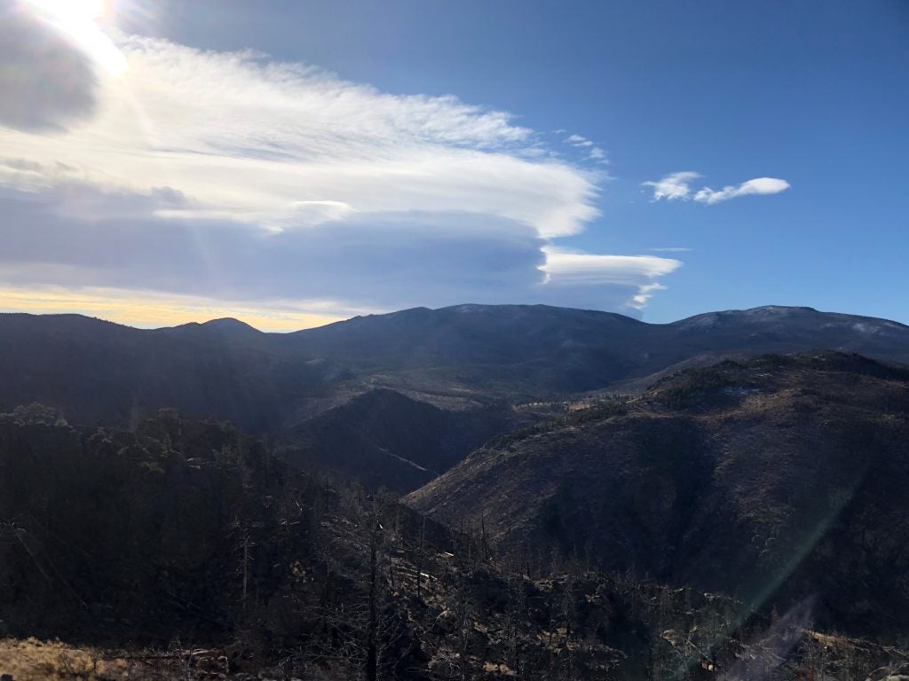
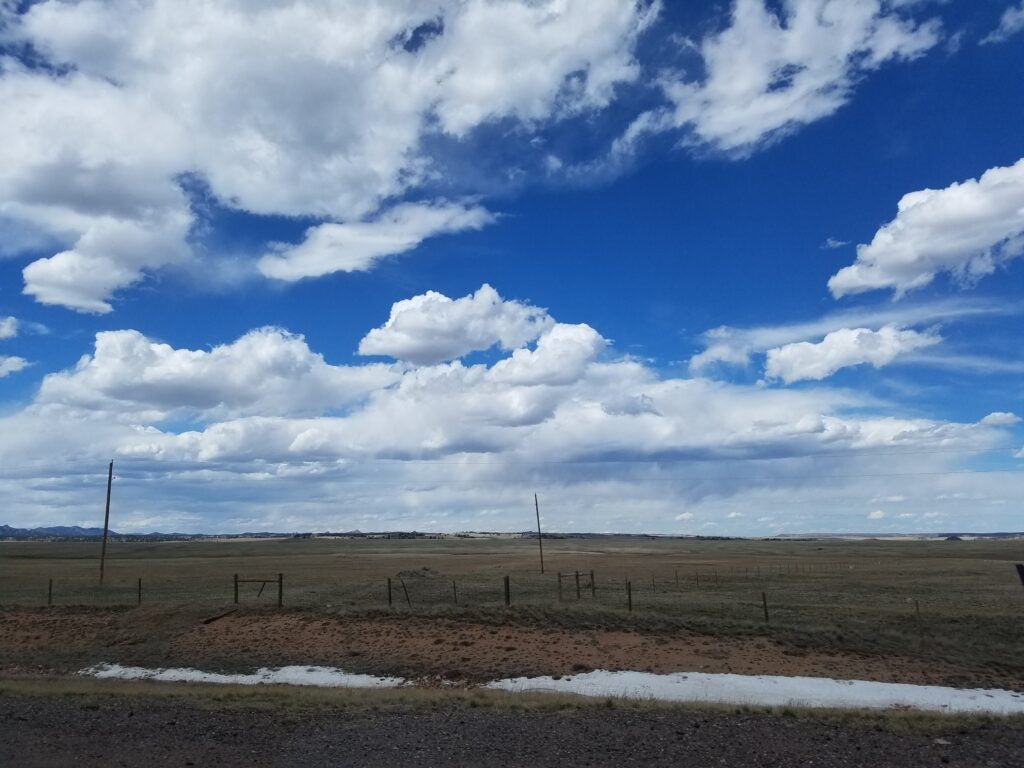
- Into NM
-
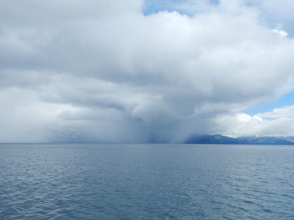
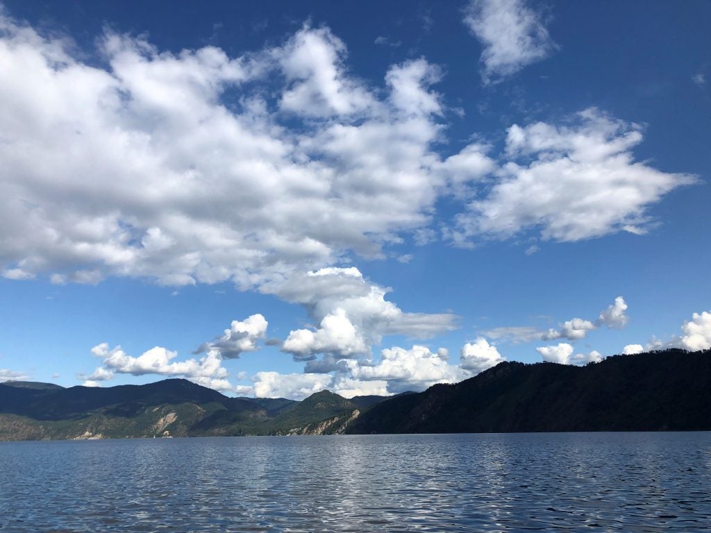
- Tahoe © Jenae Clay
-
- Cold Convection © Kosana Suvočarev
-
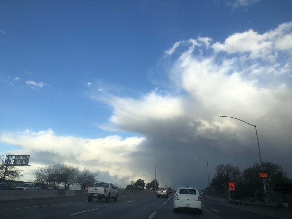
- Smoke over Davis
-
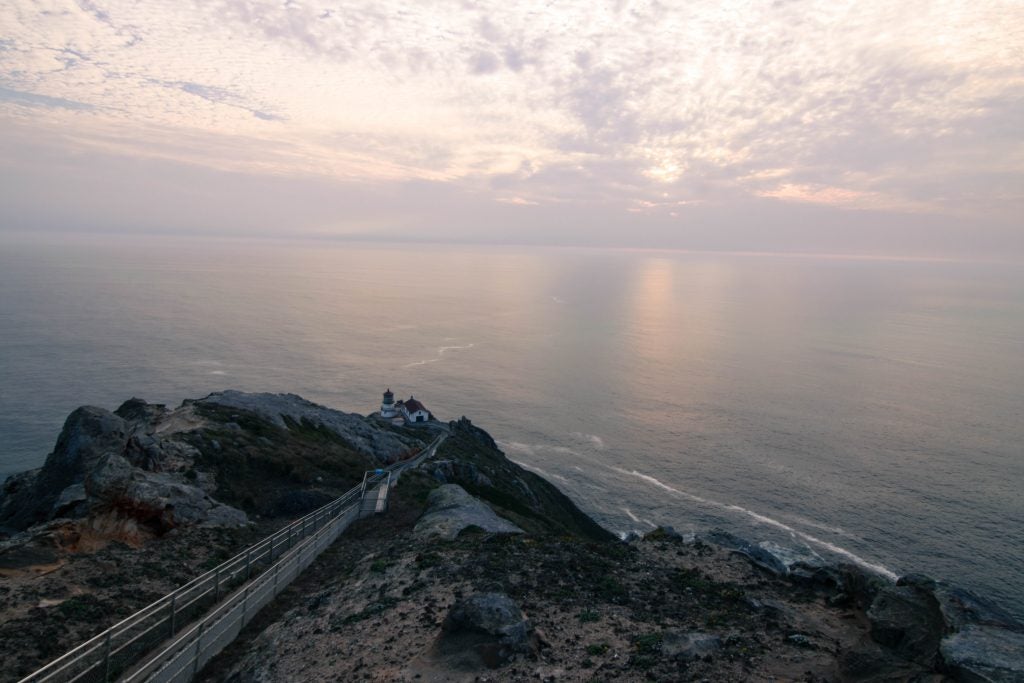
- Point Reyes Lighthouse. © Katherine Chin
-
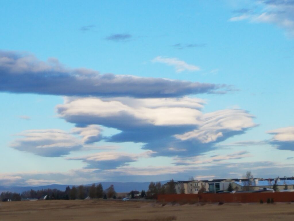
- Pancake Lenticulars © Nick Falk
-
- Ice-fall
-
- Ocean Undulatus © Lucas Sterzinger
-
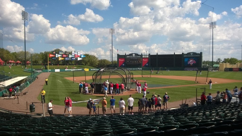
- Grapefruit League Clouds
-
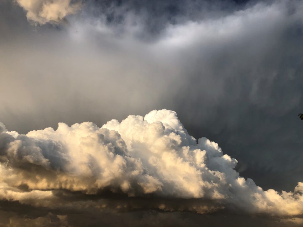
- Pedestal and Anvil Mammatus © John Igel
-
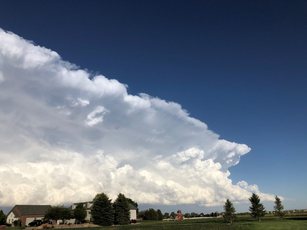
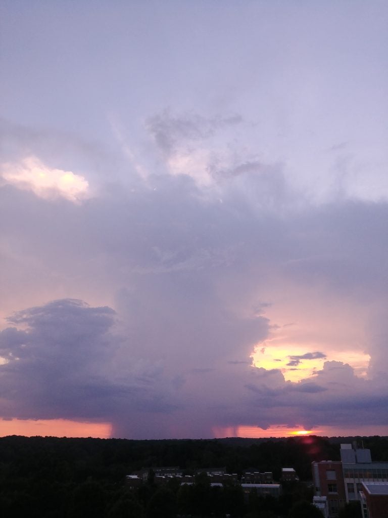
- Supercell over Davis © Ameya Naik
-
- Midlevel Virga © Alexis Clouser
-
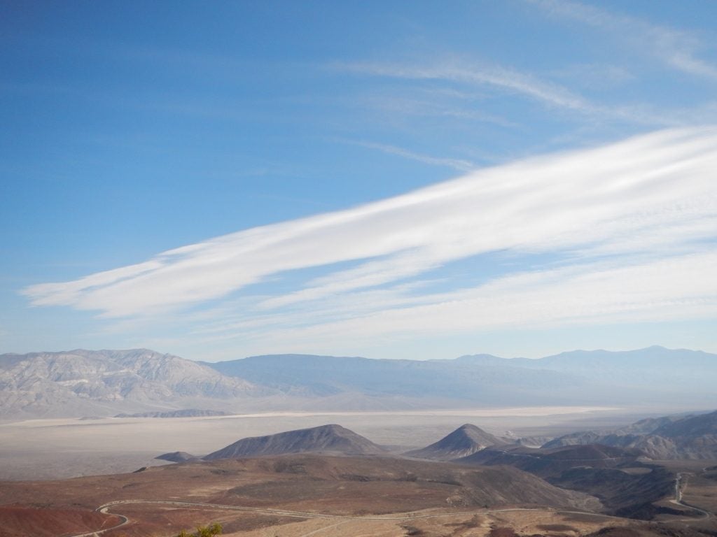
- Death Valley Cirrus © Jenae Clay
-
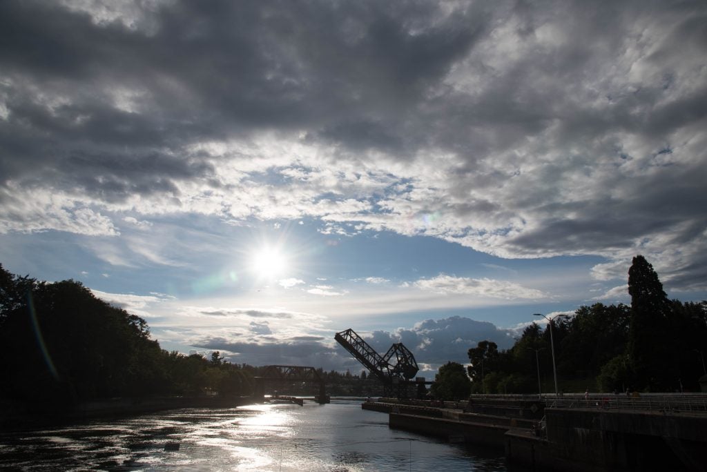
- Ballard Locks. © Katherine Chin
-
- Wet and Dry
-
- Rain over North GA. © Laura Gray.
-
- Tornado warning. © Megan Schmiedeler.
-
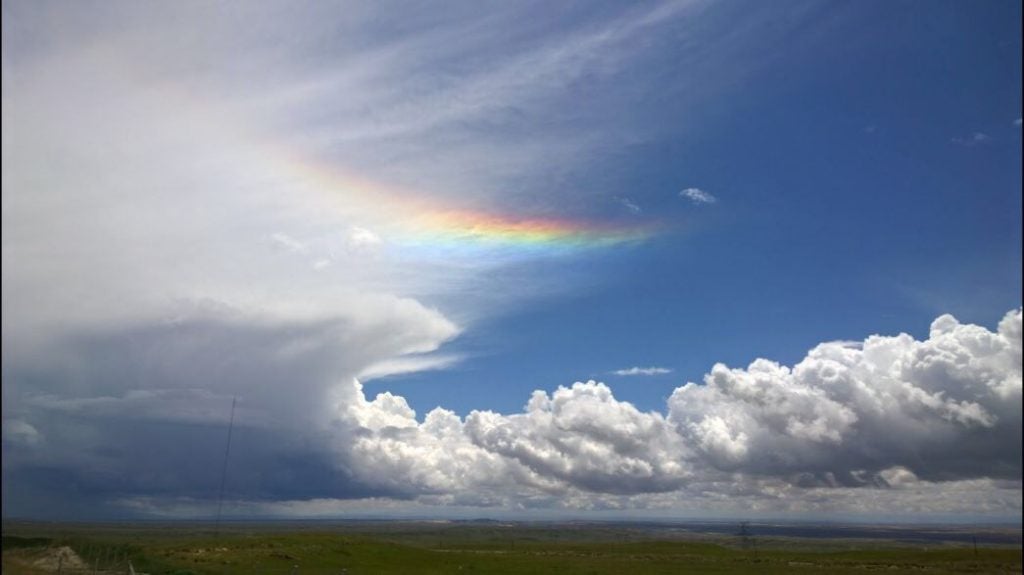
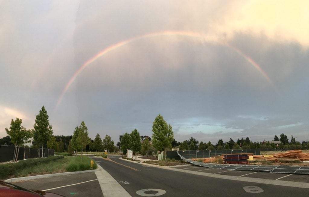
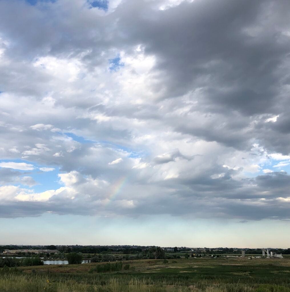
- Qinghai Bow © Lea Tong
-
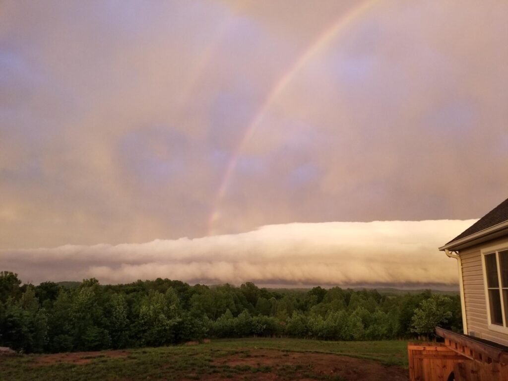
- Double Bow
-
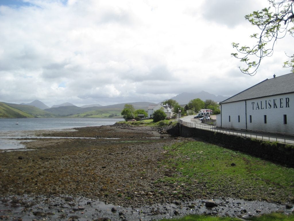
- Talisker Bay
-
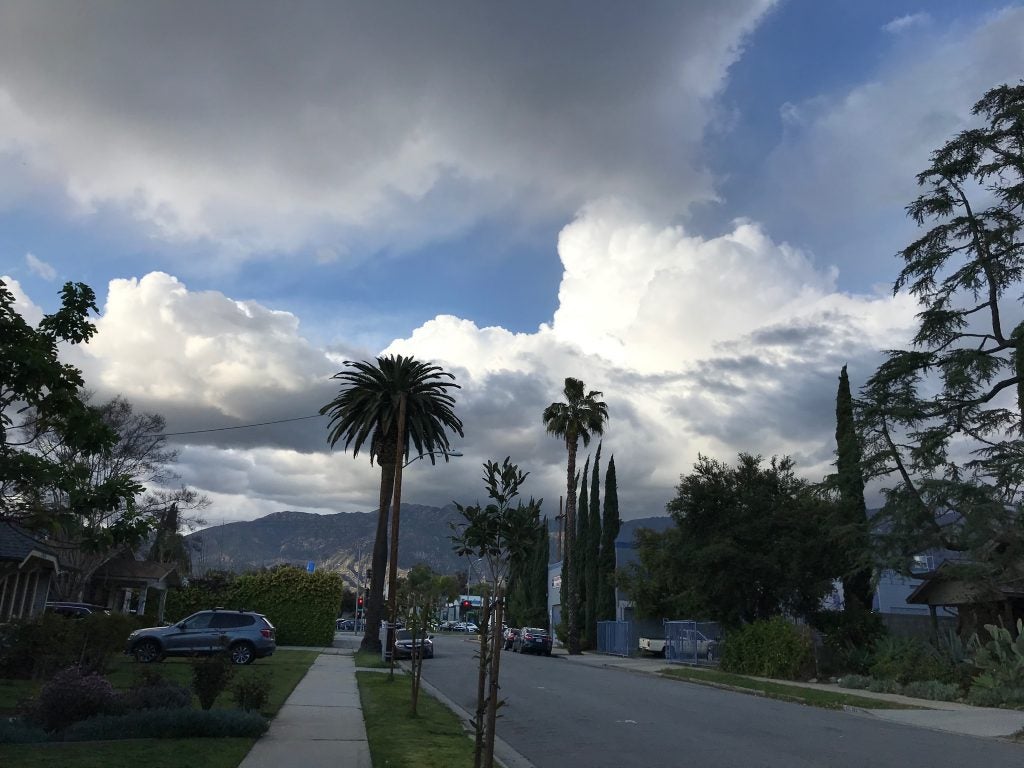
- Pasadena Spring © Rachel Storer
-
- Stormin’ Norman…dy © Lucas Sterzinger
-
- Clouds over Winter Park © Eric Maloney
-
- Deception Pass Stratus © John Igel
-
- Doublish © Jenae Clay
-
- Virga Bow
-
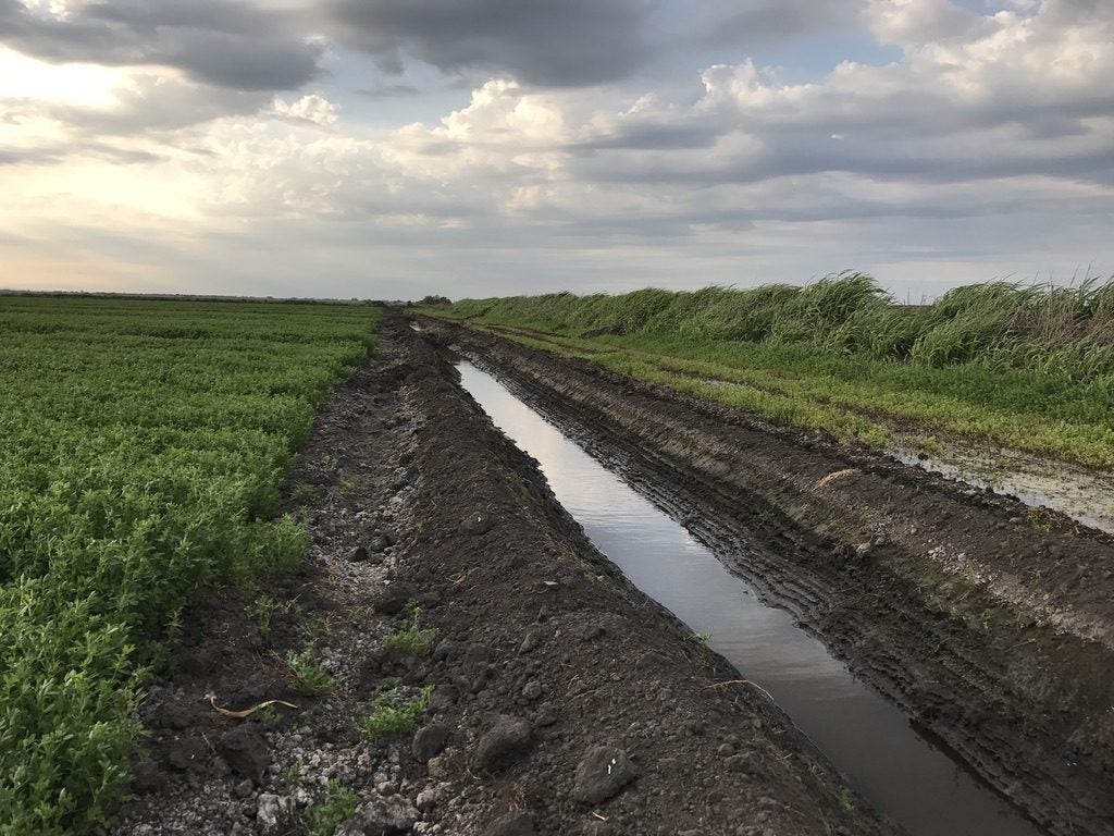
- Drainage © Jenae Clay
-
- Sage
-
- Mt Baker Fog © John Igel
-
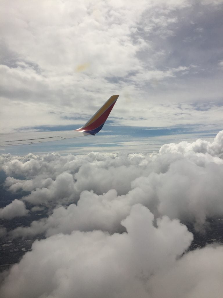
- Landing at LAX in Snow © Aryn Braun
-
- Power plant plume. © Jen Power.
-
- Davis Hail © Ameya Naik
-
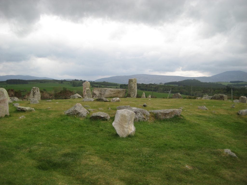
- Stone Circle
-
- Mono Lake © Nicholas Falk
-
- Stacked in WY. © Jen Power.
-
- Pancakes
-
- Lake Pend Cumulus © John Igel
-
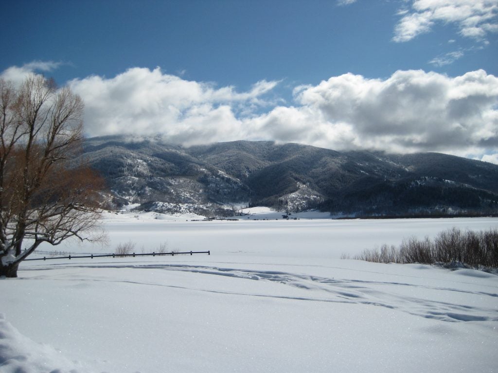
- Steamboat Springs
-
- Mt Diablo © Jenae Clay
-
- Medium Cb from Monterey © Alexis Clouser
-
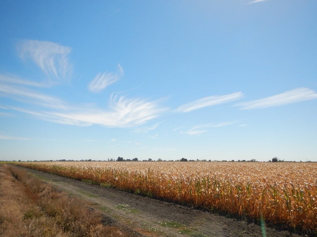
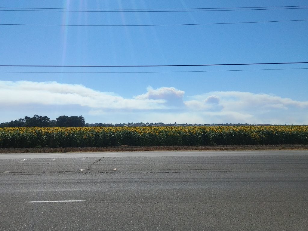
- Delta Corn © Jenae Clay
-
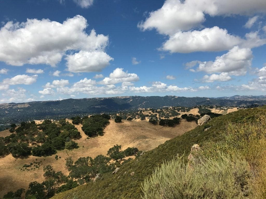
- Winters CA © Jenae Clay
-
- Cirro-Cu?
-
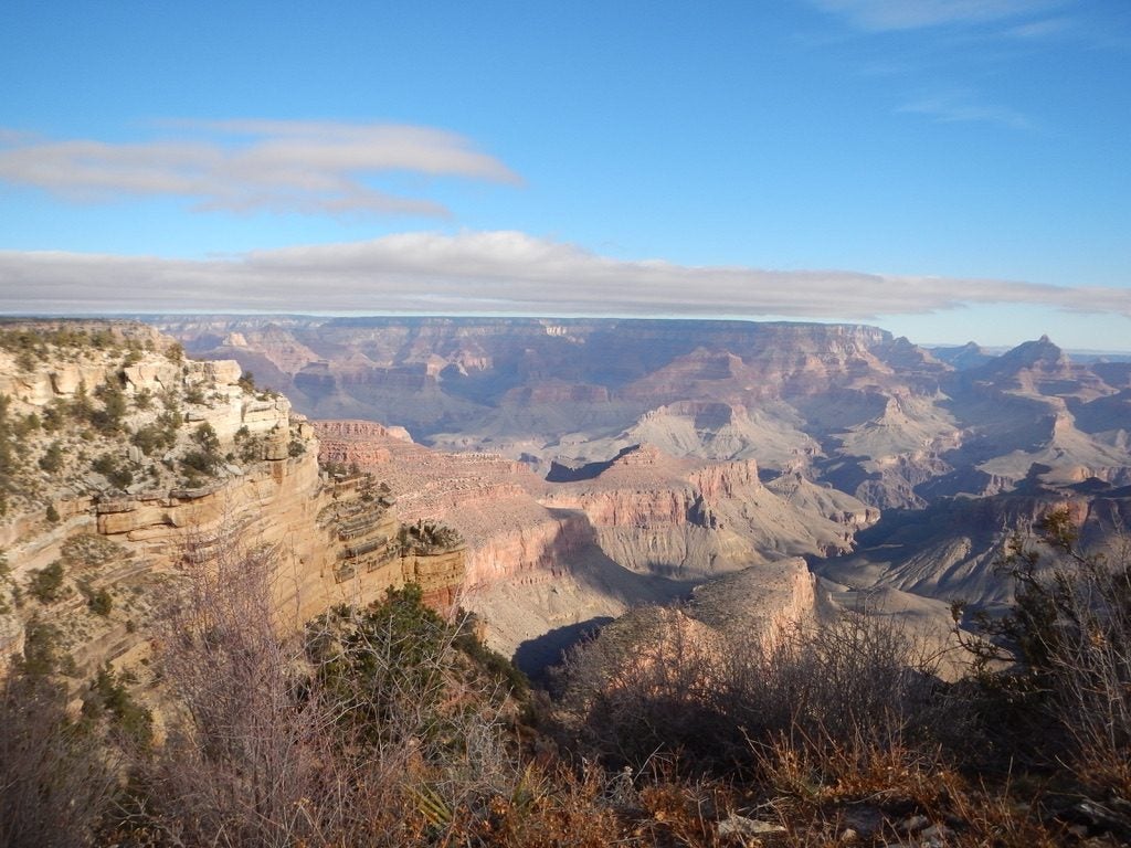
- Grand Canyon © Jenae Clay
-
- Sunset in Seattle. © Katherine Chin
-
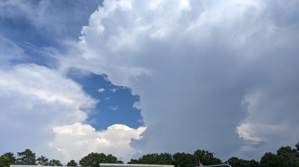
- Raleigh Storm
-
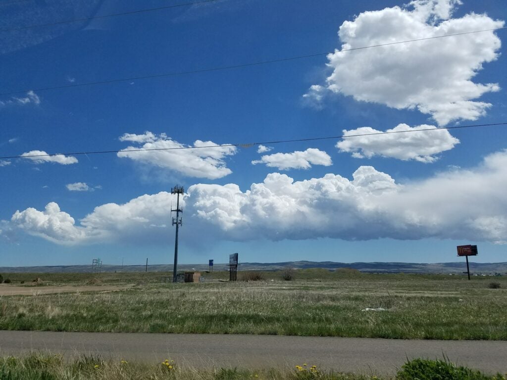
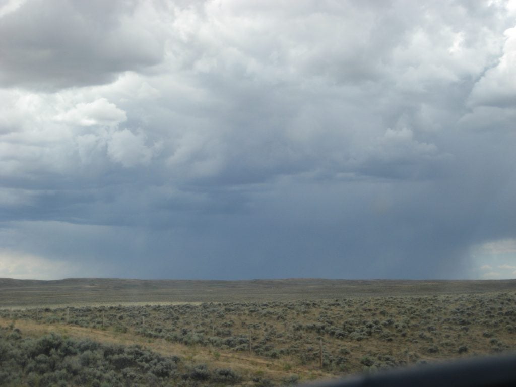
- Wyoming BL
-
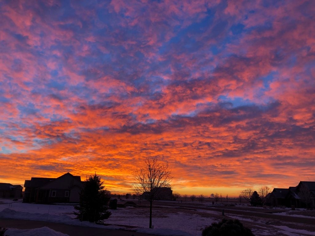
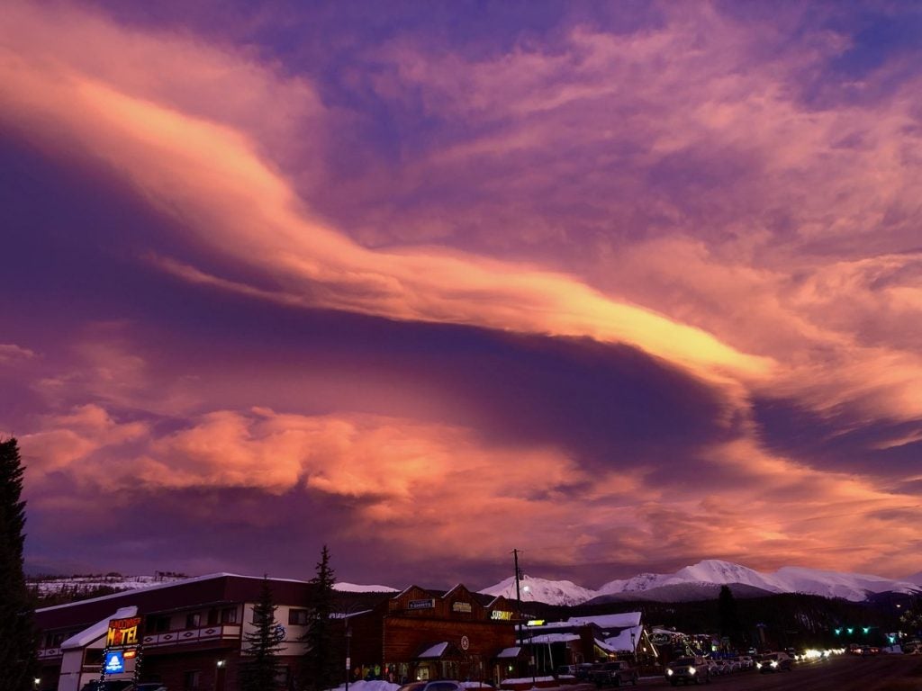
- Sunrise in Windsor © John Igel
-
- Waves
-

- Multiple Cloud Types © Jillian Olivar
-
- Sea Breeze
-
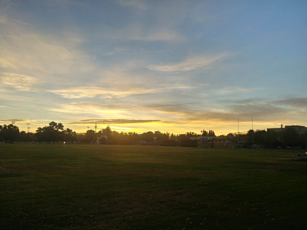
- Morning in Davis
-
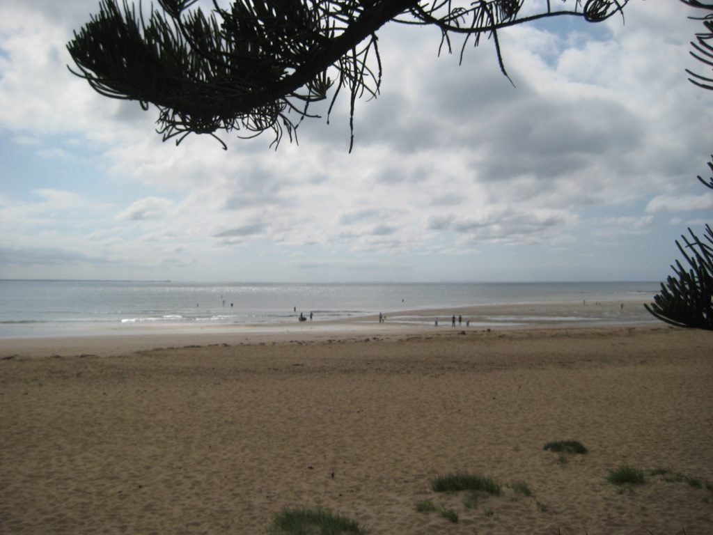
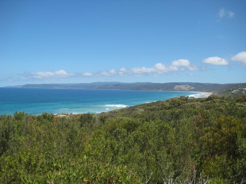
- Australian Beach
-
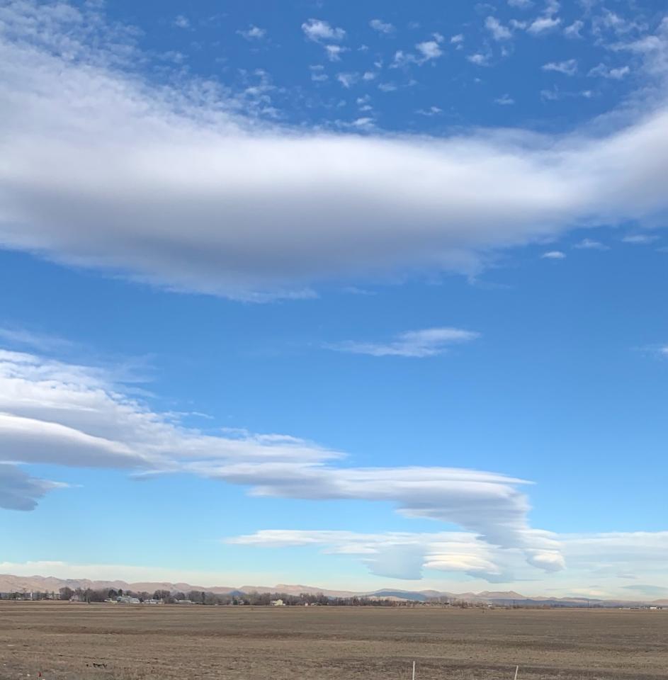
- Valley Lenticulars. © Lewin Bormann
-
- Sunset Virga © John Igel
-
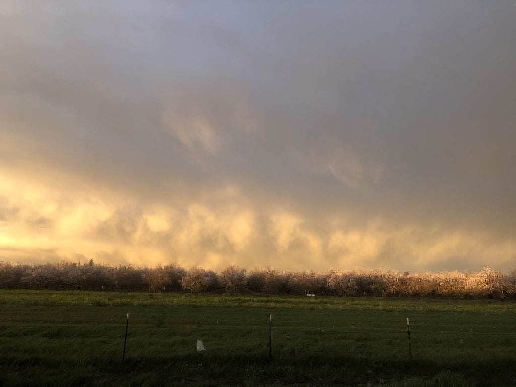
- Almonds and Graupel © Kosana Suvočarev
-
- Multi-Layer © Jillian Olivar
-
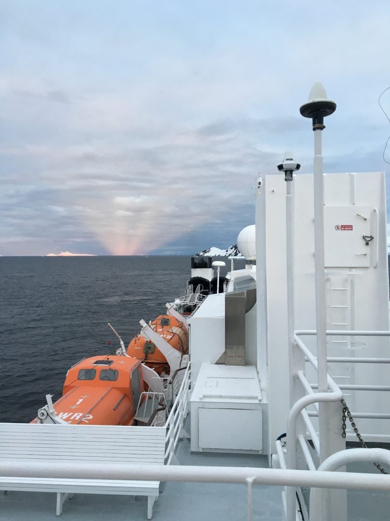
- Coastal Antarctica. © Megan Schmiedeler.
-
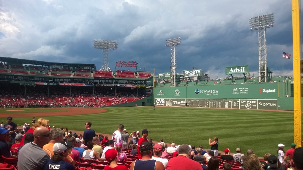
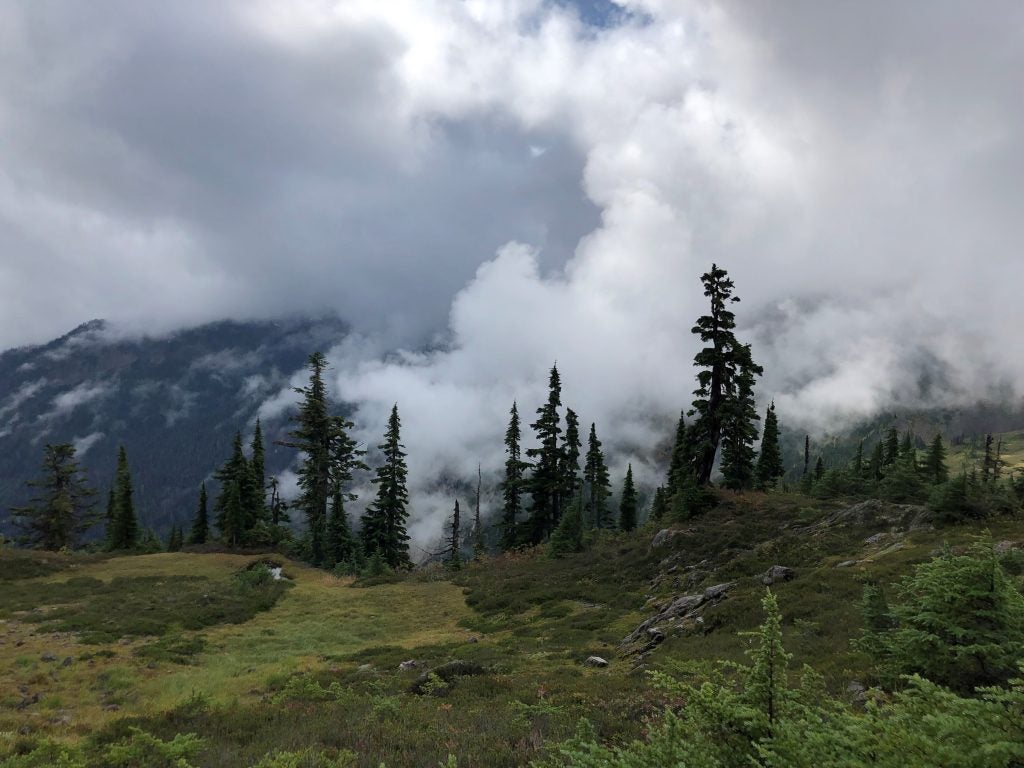
- Clouds over the Green Monster
-
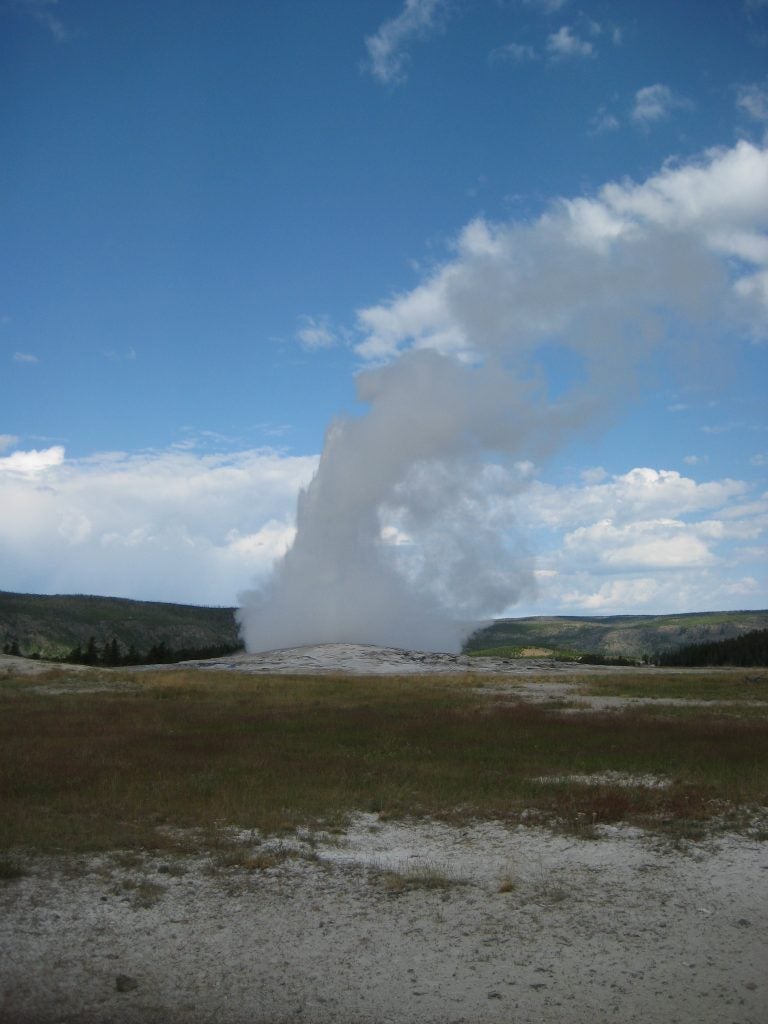
- Yellowstone
-
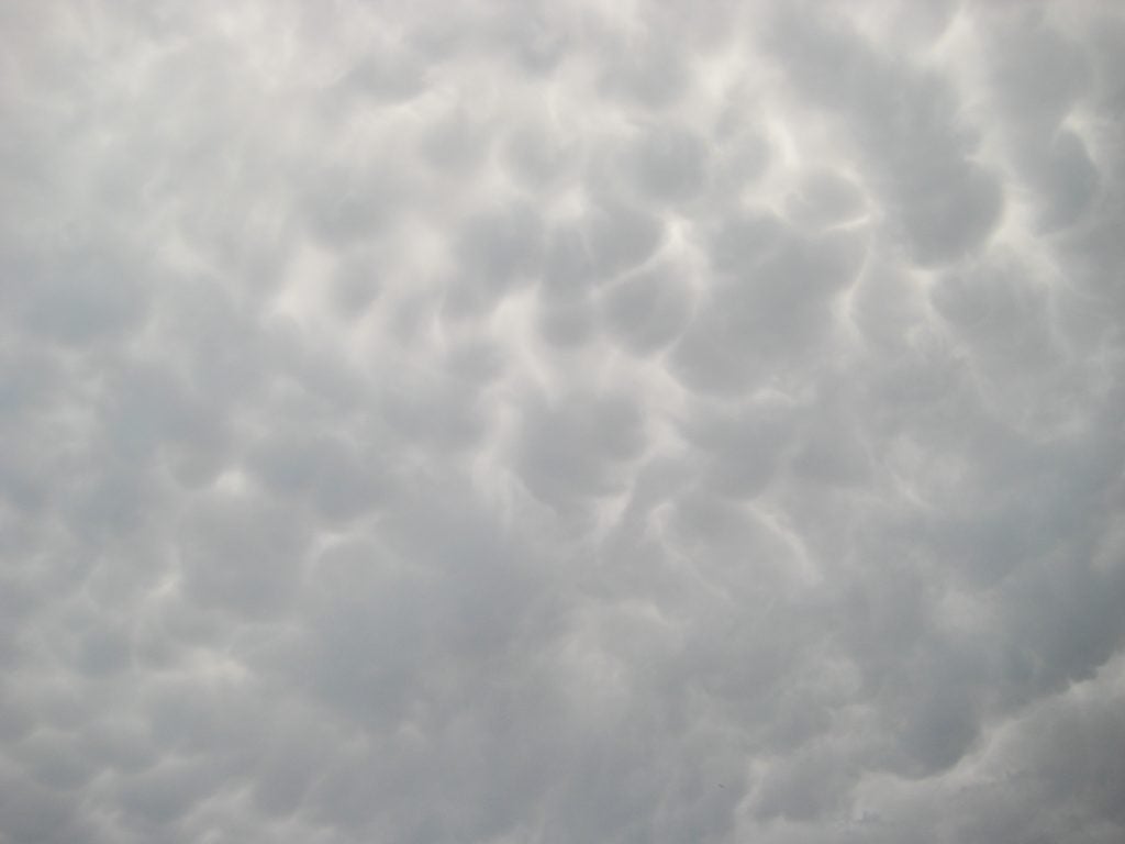
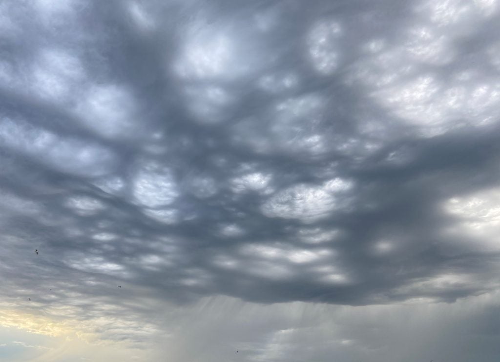
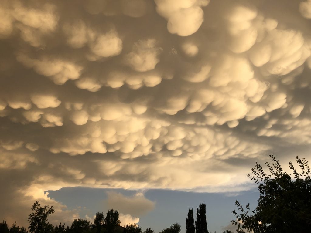
- Mammatus
-
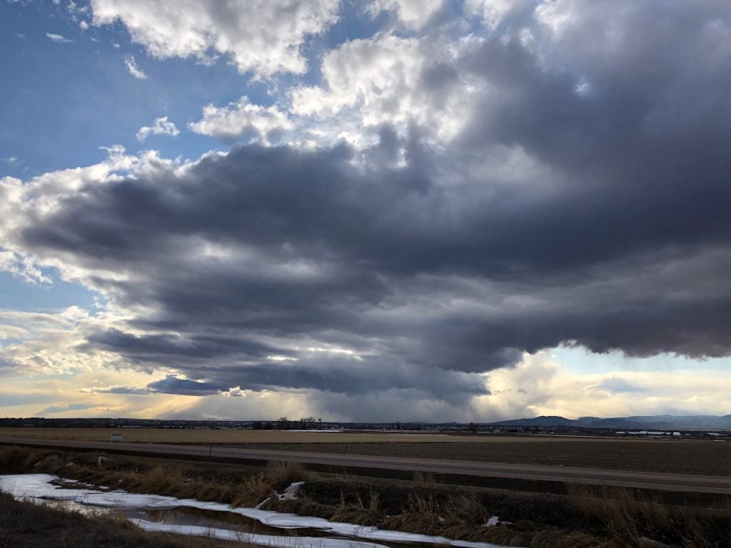
- Snow Rolling Off the Front Range © John Igel
-
- NJ Downpour © Lea Tong
-
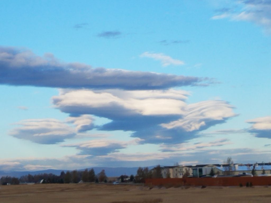
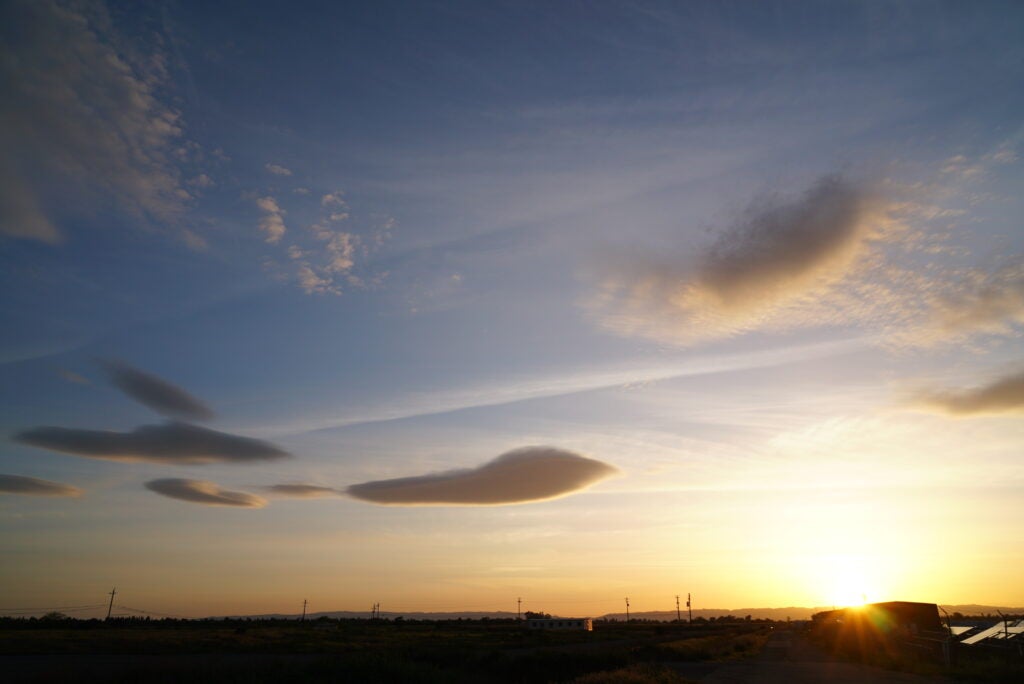
- Fuzzy Lenticulars
-
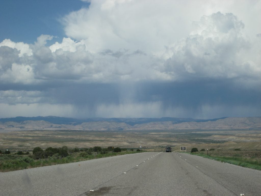
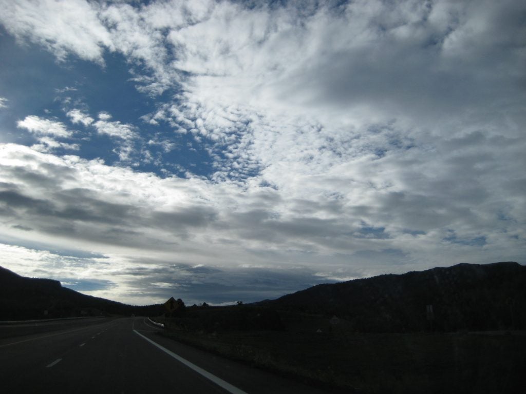
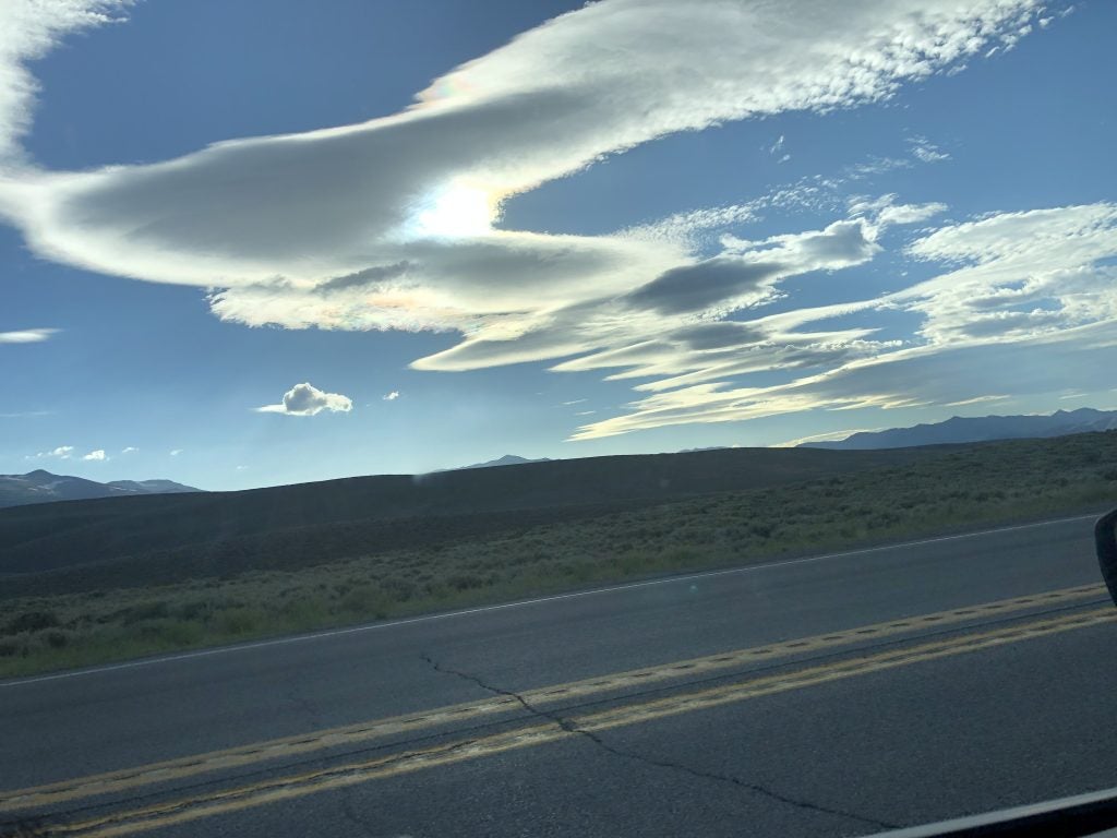
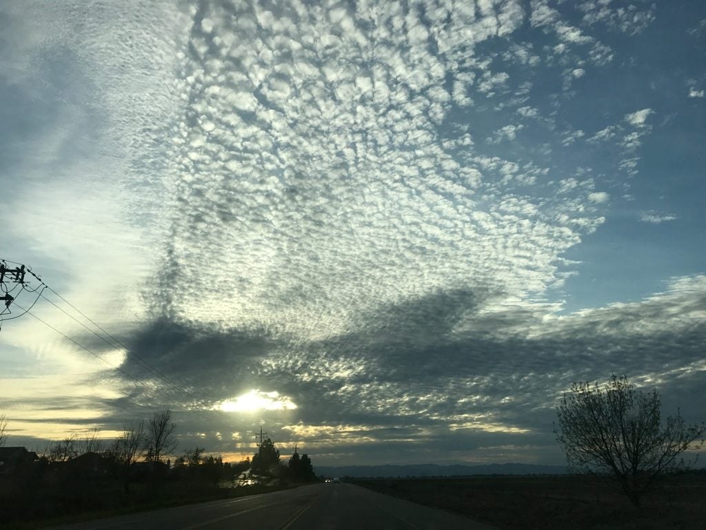
- Long Road
-
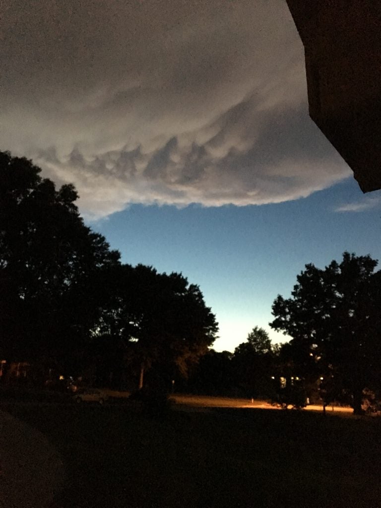
- Cold Pool Cap © John Igel